2018-12-04 07:08:40 +00:00
2019-05-27 10:32:08 +00:00
[](https://opensource.org/licenses/MIT)
[](https://badge.fury.io/js/primevue)
2022-11-18 07:40:29 +00:00
[](https://discord.gg/gzKFYnpmCY)
2018-12-04 07:08:40 +00:00
2022-11-18 07:40:29 +00:00
[](https://www.primefaces.org/primevue-v2/#/)
2018-12-04 07:08:40 +00:00
2022-11-18 07:40:29 +00:00
# PrimeVue
2019-05-27 10:32:08 +00:00
2022-11-18 07:40:29 +00:00
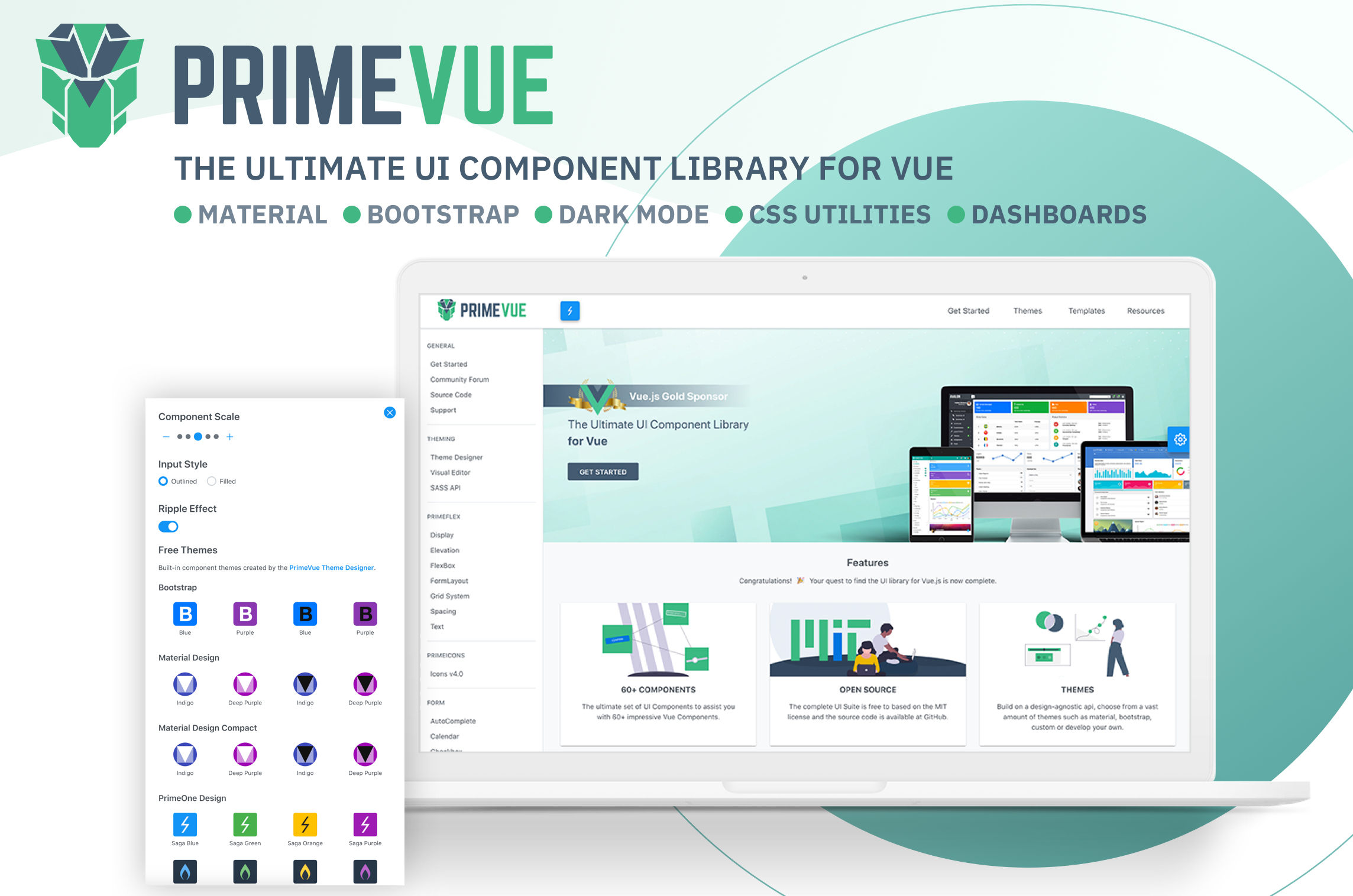
Visit the [PrimeVue Website ](https://www.primefaces.org/primevue-v2/#/ ) for general information, demos and documentation.
## Downloads
PrimeVue is available at npm, if you have an existing application run the following command to download it to your project.
````
npm install primevue@^2 --save
npm install primeicons --save
````
or
```
yarn add primevue@^2
yarn add primeicons
```
## Import
### Module
```javascript
import PrimeVue from 'primevue/config';
import Dialog from 'primevue/dialog';
Vue.component('Dialog', Dialog);
Vue.use(PrimeVue);
```
Finally you'll be able to utilize the component in your application. See the Styles section to apply styling.
```vue
< Dialog > < / Dialog >
```
## Script Tag
Other alternative is utilizing the components directly within the browser with the ** *iife*** build. Note that PrimeVue does not provide a ** *umd*** build.
```javascript
< html >
< head >
< meta charset = "utf-8" >
< title > calendar demo< / title >
< link href = "https://unpkg.com/primevue^2/resources/themes/saga-blue/theme.css " rel = "stylesheet" >
< link href = "https://unpkg.com/primevue^2/resources/primevue.min.css " rel = "stylesheet" >
< link href = "https://unpkg.com/primeicons/primeicons.css " rel = "stylesheet" >
< script src = "https://unpkg.com/vue" > < / script >
< script src = "https://unpkg.com/primevue^2/calendar/calendar.umd.min.js" > < / script >
< div id = "app" >
< p-calendar > < / p-calendar >
< / div >
< script >
new Vue({
components: {
'p-calendar': calendar
}
}).$mount('#app')
< / script >
< / head >
< / html >
```
## Configuration
### Dependencies
Majority of PrimeVue components (95%) are native and there are some exceptions having 3rd party dependencies such as Quill for Editor.
In addition, components require PrimeIcons library for icons.
```javascript
dependencies: {
"vue": "^2.6.10",
"primeicons": "^6.0.0"
}
```
## Styles
The css dependencies are as follows, note that you may change the theme with another one of your choice.
```css
primevue/resources/themes/saga-blue/theme.css //theme
primevue/resources/primevue.min.css //core css
primeicons/primeicons.css //icons
```
If you are using a bundler such as webpack with a css loader you may also import them to your main application component.
```javascript
import 'primevue/resources/themes/lara-light-indigo/theme.css';
import 'primevue/resources/primevue.min.css';
import 'primeicons/primeicons.css';
```
## Nuxt Integration
PrimeVue has a built-in nuxt module. Open ** *nuxt.config.js*** and add ** *primevue/nuxt*** to the modules section along with your configuration.
**nuxt.config.js**
Open the nuxt configuration file and add the css dependencies.
```javascript
modules: [
[
'primevue/nuxt', {
theme: string, //name of the theme, defaults to saga-blue
ripple: boolean, //whether the ripple animation is enabled, defaults to false
components: [], //an array of components to be registered
directives: [] //an array of directives to be registered
}
]
]
```
Here is an example configuration.
```javascript
modules: [
[
'primevue/nuxt', {
theme: 'md-light-indigo',
ripple: true,
components: ['InputText','Button','DataTable','Dialog'],
directives: ['Tooltip','Badge']
}
]
]
```
An alternative configuration is possible using the ** *primevue*** property.
```javascript
modules: ['primevue/nuxt'],
primevue: {
theme: 'md-light-indigo',
ripple: true,
components: ['InputText','Button','DataTable','Dialog'],
directives: ['Tooltip','Badge']
}
```