|
|
||
|---|---|---|
| .github | ||
| api-generator | ||
| public | ||
| src | ||
| tests/unit | ||
| .babelrc-lib | ||
| .browserslistrc | ||
| .editorconfig | ||
| .eslintrc.js | ||
| .gitignore | ||
| .npmignore | ||
| CHANGELOG.md | ||
| LICENSE.md | ||
| README.md | ||
| babel.config.js | ||
| build-lib.js | ||
| gulpfile.js | ||
| package-build.json | ||
| package.json | ||
| postcss.config.js | ||
| vue.config.js | ||
README.md
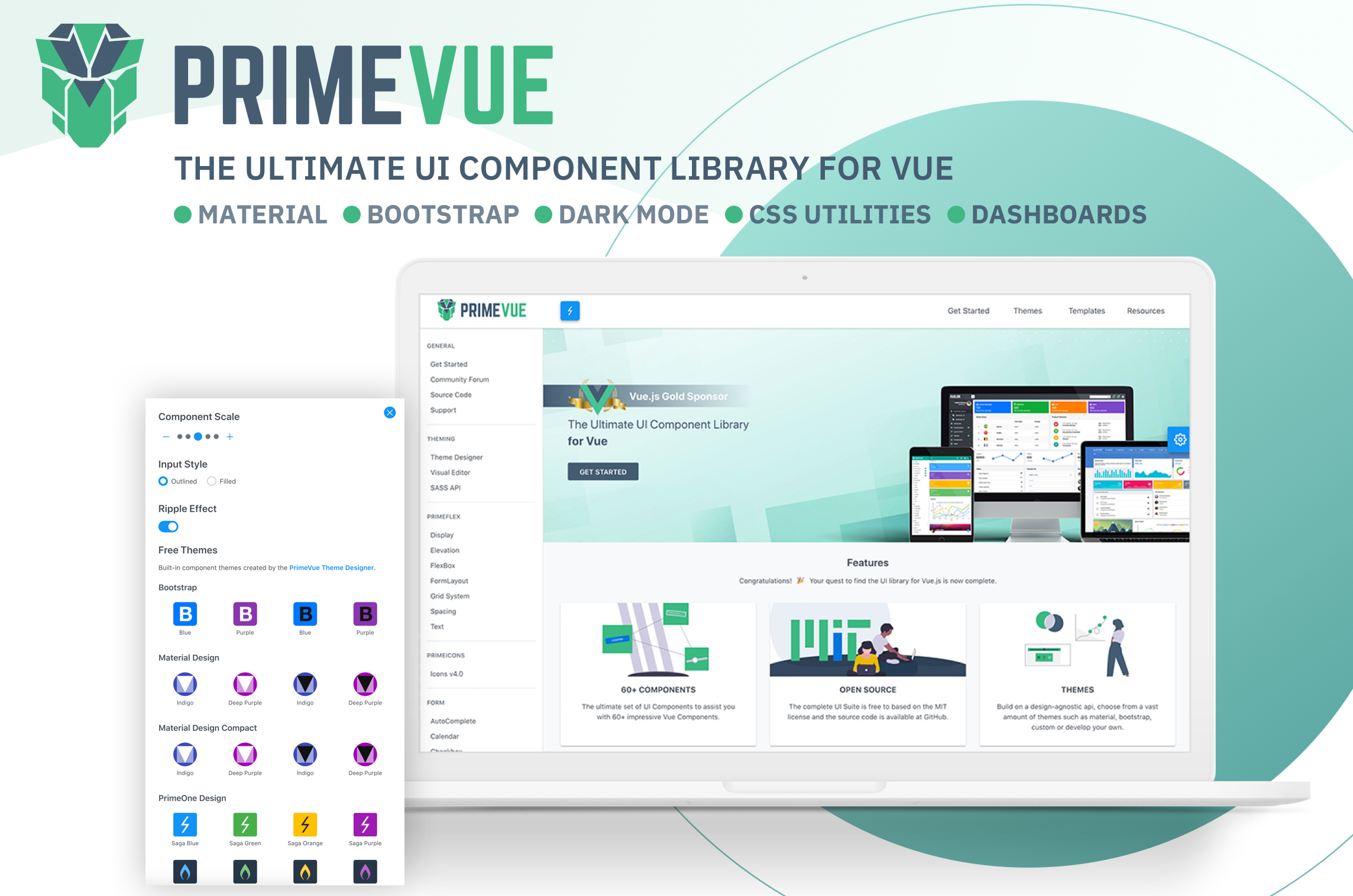
PrimeVue
Visit the PrimeVue Website for general information, demos and documentation.
Downloads
PrimeVue is available at npm, if you have an existing application run the following command to download it to your project.
npm install primevue@^2 --save
npm install primeicons --save
or
yarn add primevue@^2
yarn add primeicons
Import
Module
import PrimeVue from 'primevue/config';
import Dialog from 'primevue/dialog';

Vue.component('Dialog', Dialog);
Vue.use(PrimeVue);
Finally you'll be able to utilize the component in your application. See the Styles section to apply styling.
<Dialog></Dialog>
Script Tag
Other alternative is utilizing the components directly within the browser with the iife build. Note that PrimeVue does not provide a umd build.
<html>
    <head>
        <meta charset="utf-8">
        <title>calendar demo</title>
        <link href="https://unpkg.com/primevue^2/resources/themes/saga-blue/theme.css " rel="stylesheet">
        <link href="https://unpkg.com/primevue^2/resources/primevue.min.css " rel="stylesheet">
        <link href="https://unpkg.com/primeicons/primeicons.css " rel="stylesheet">
        <script src="https://unpkg.com/vue"></script>
        <script src="https://unpkg.com/primevue^2/calendar/calendar.umd.min.js"></script>

        <div id="app">
            <p-calendar></p-calendar>
        </div>

        <script>
            new Vue({
                components: {
                    'p-calendar': calendar
                }
            }).$mount('#app')
        </script>

    </head>
</html>
Configuration
Dependencies
Majority of PrimeVue components (95%) are native and there are some exceptions having 3rd party dependencies such as Quill for Editor.
In addition, components require PrimeIcons library for icons.
dependencies: {
    "vue": "^2.6.10",
    "primeicons": "^6.0.0"
}
Styles
The css dependencies are as follows, note that you may change the theme with another one of your choice.
primevue/resources/themes/saga-blue/theme.css       //theme
primevue/resources/primevue.min.css                 //core css
primeicons/primeicons.css                           //icons
If you are using a bundler such as webpack with a css loader you may also import them to your main application component.
import 'primevue/resources/themes/lara-light-indigo/theme.css';
import 'primevue/resources/primevue.min.css';
import 'primeicons/primeicons.css';
Nuxt Integration
PrimeVue has a built-in nuxt module. Open nuxt.config.js and add primevue/nuxt to the modules section along with your configuration.
nuxt.config.js
Open the nuxt configuration file and add the css dependencies.
modules: [
    [
        'primevue/nuxt', {
            theme: string,      //name of the theme, defaults to saga-blue
            ripple: boolean,    //whether the ripple animation is enabled, defaults to false
            components: [],     //an array of components to be registered
            directives: []      //an array of directives to be registered
        }
    ]
]
Here is an example configuration.
modules: [
    [
        'primevue/nuxt', {
            theme: 'md-light-indigo',
            ripple: true,
            components: ['InputText','Button','DataTable','Dialog'],
            directives: ['Tooltip','Badge']
        }
    ]
]
An alternative configuration is possible using the primevue property.
modules: ['primevue/nuxt'],
primevue: {
    theme: 'md-light-indigo',
    ripple: true,
    components: ['InputText','Button','DataTable','Dialog'],
    directives: ['Tooltip','Badge']
}


